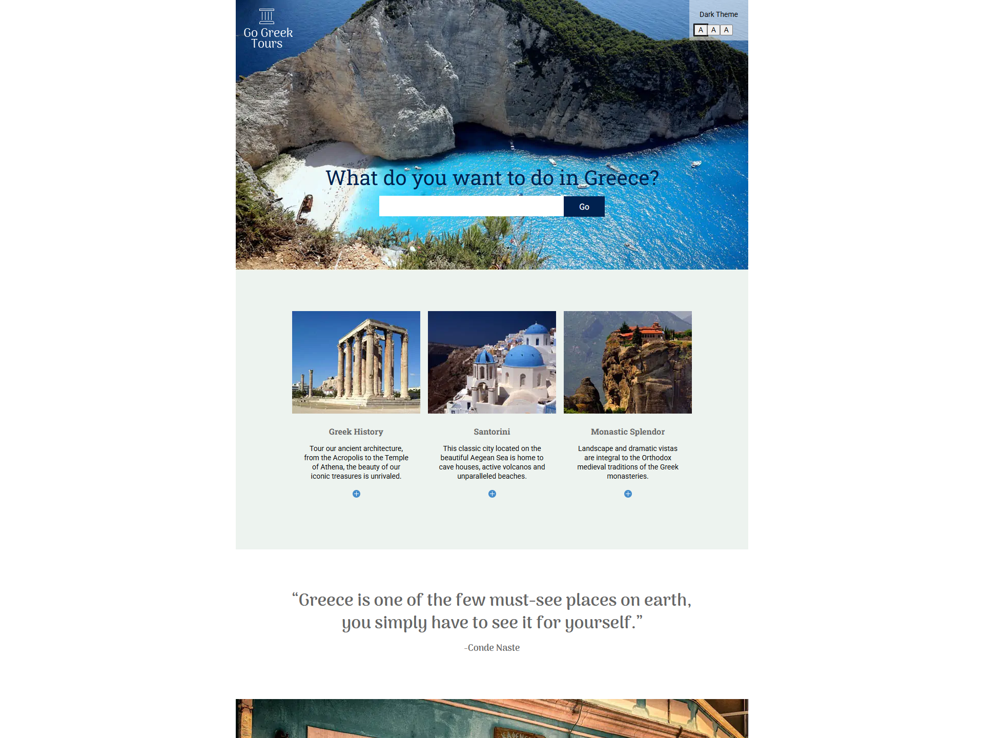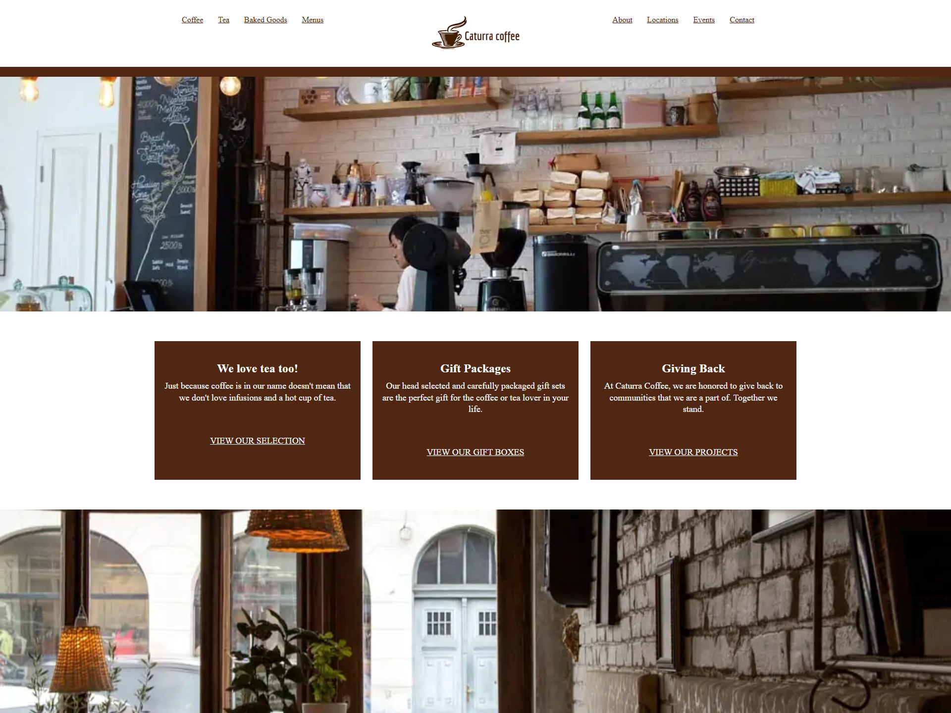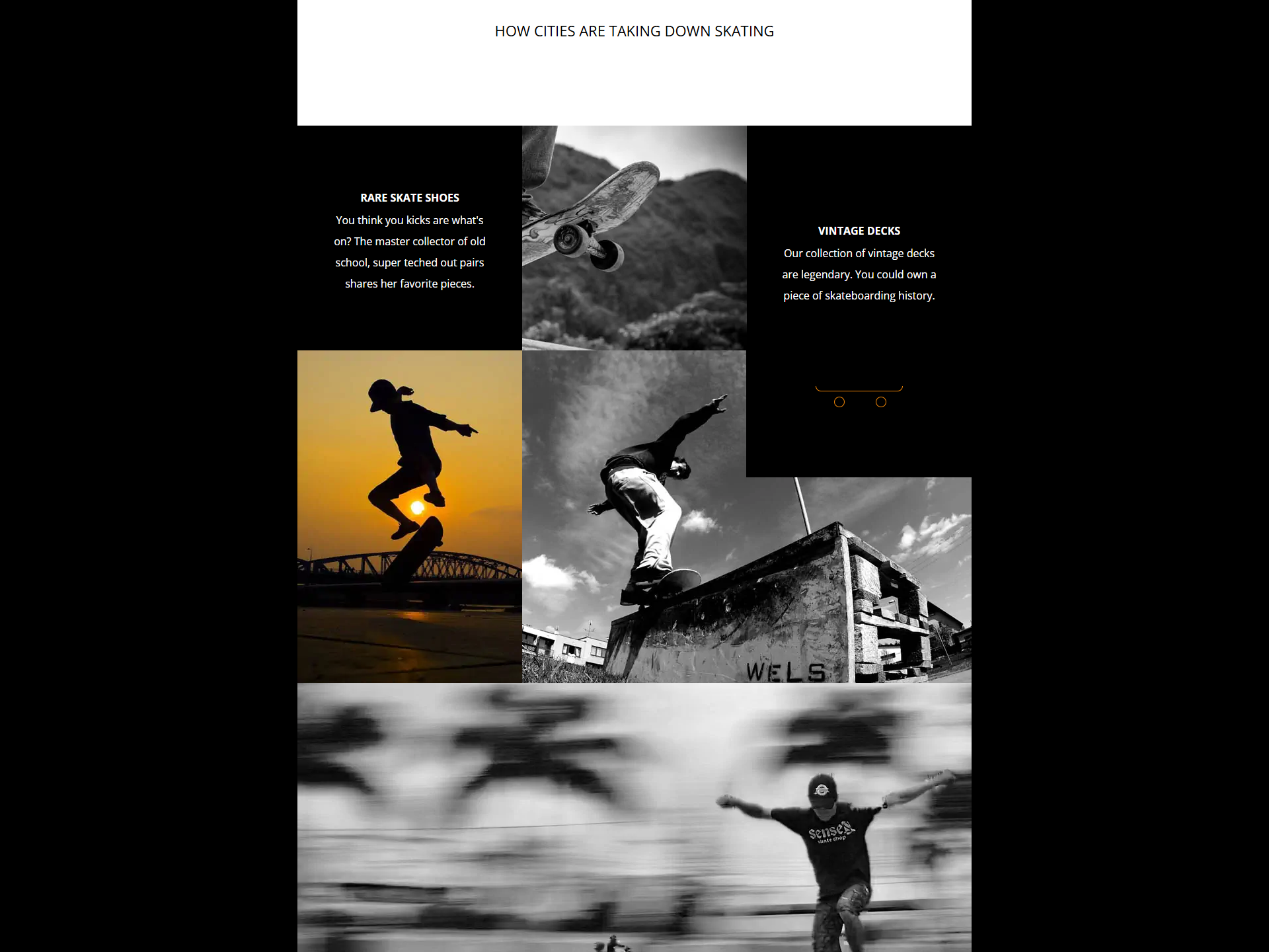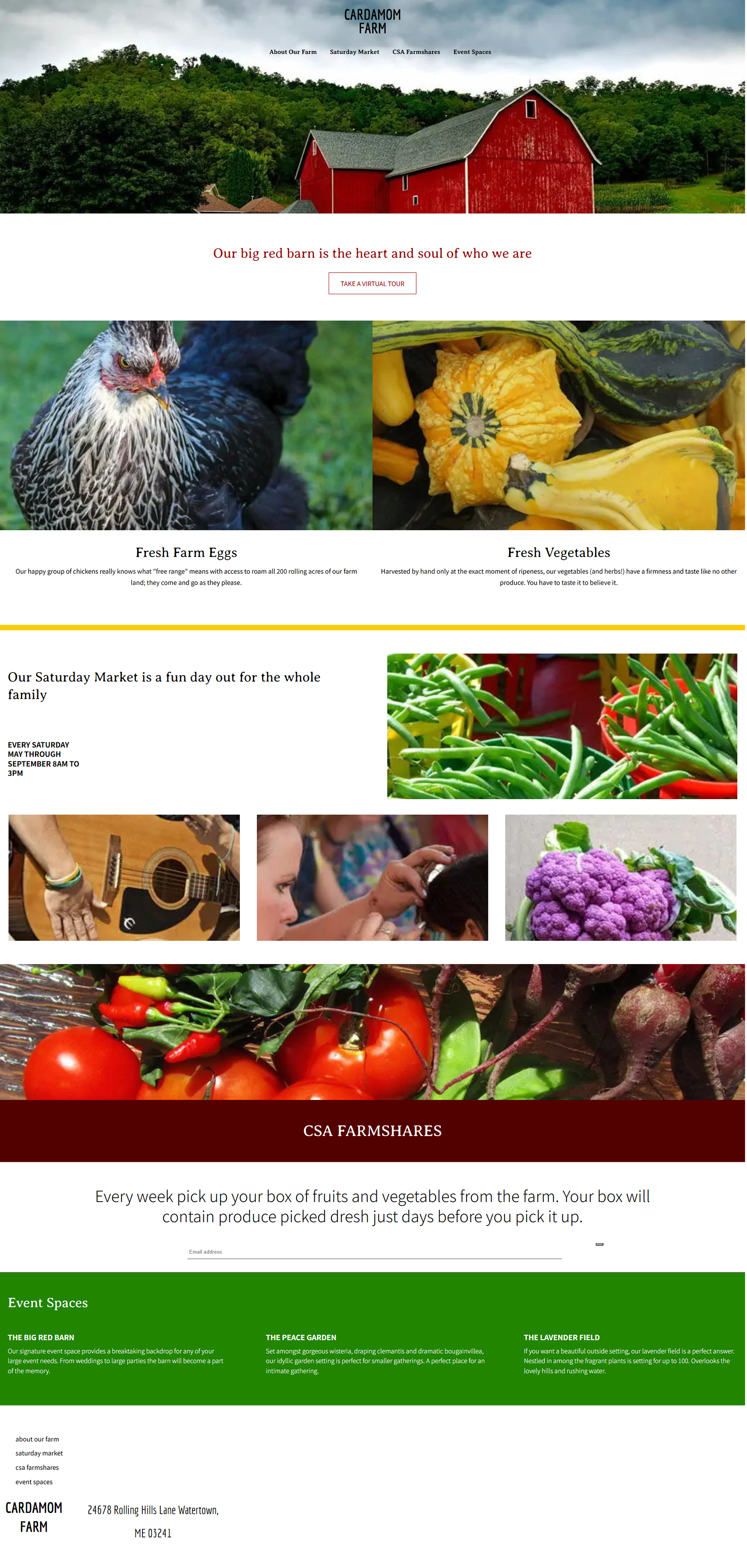
This project was built using HTML5 and CSS3 with a focus on modern layout techniques. I implemented CSS Flexbox to create a responsive, multi-section design that adapts across different screen sizes using media queries. The site features custom typography, background imagery, and interactive hover effects, while also including print styles and fallbacks for older browsers. This project demonstrates my ability to structure semantic HTML, apply advanced CSS, and design for accessibility and responsiveness without relying on frameworks like Bootstrap.